Context & Challenge
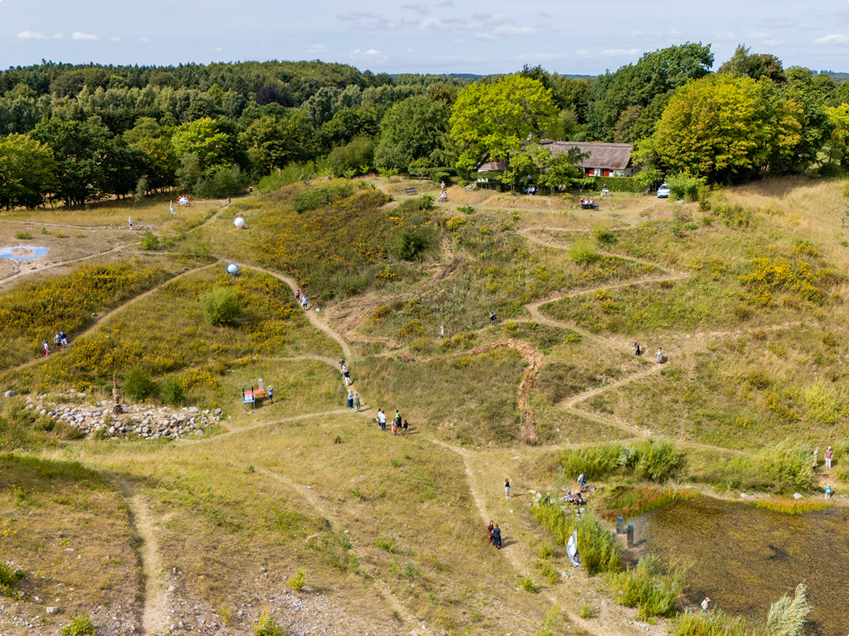
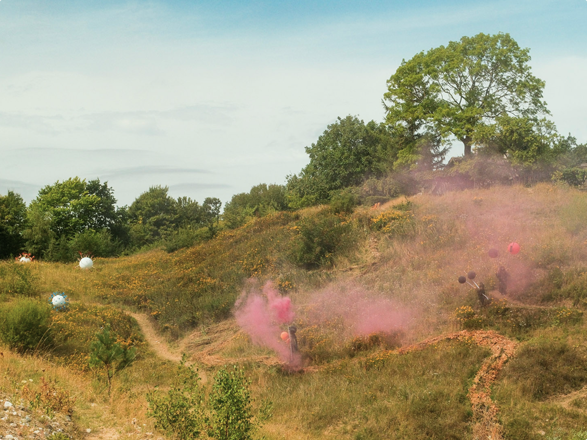
Gravel Art is a recurring group exhibition held in a disused gravel pit.
For its seventh edition in August 2026, the challenge was to create communication materials that could capture attention while clearly presenting extensive information about 20 artists, artworks and events – all within a cohesive visual direction.
Drawing on the contours of the gravel pit’s hills and winding paths, I developed a visual identity built around diagonal lines, translated into motion paths and cut-out shapes across formats.
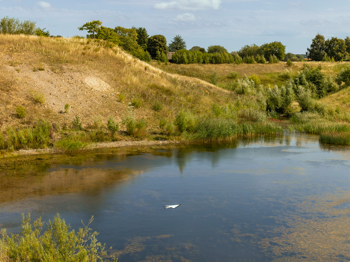
The visual direction combines the actual landscape with an organic graphic language. A blurred image of the gravel pit forms the backdrop, its blue sky, green vegetation and rainwater creating a texture that resembles a mesh gradient.
The blurred landscape shifts subtly, evoking vegetation growing across the terrain and the gentle flow of rainwater collecting at the bottom of the pit.
The diagonal lines become paths for the typography, gently waving and fading as if carried by water. The elements dissolve in sync with the fragile soundscape by local art collective Sulfo Nyt, recorded during a live performance in the gravel pit.
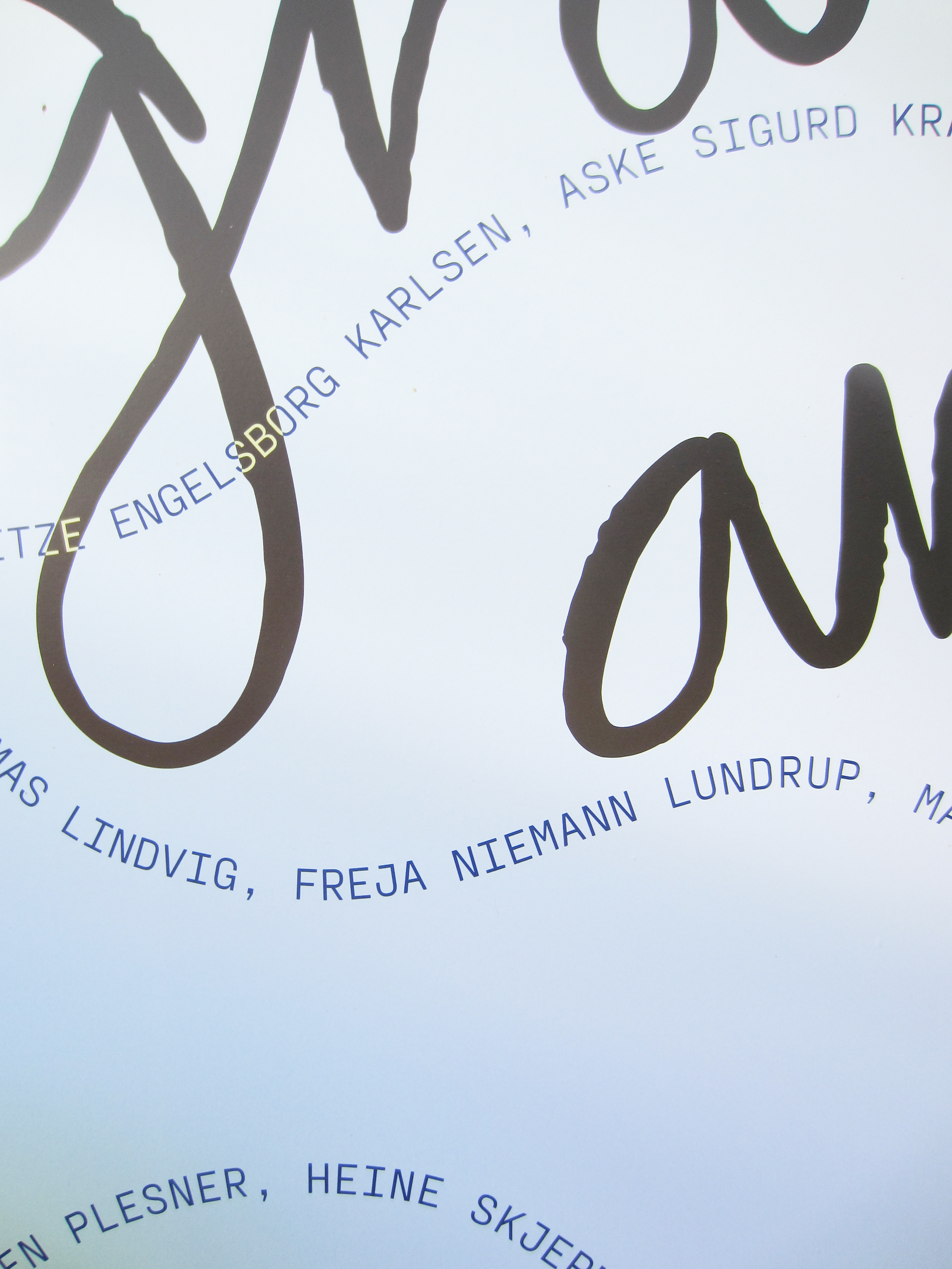
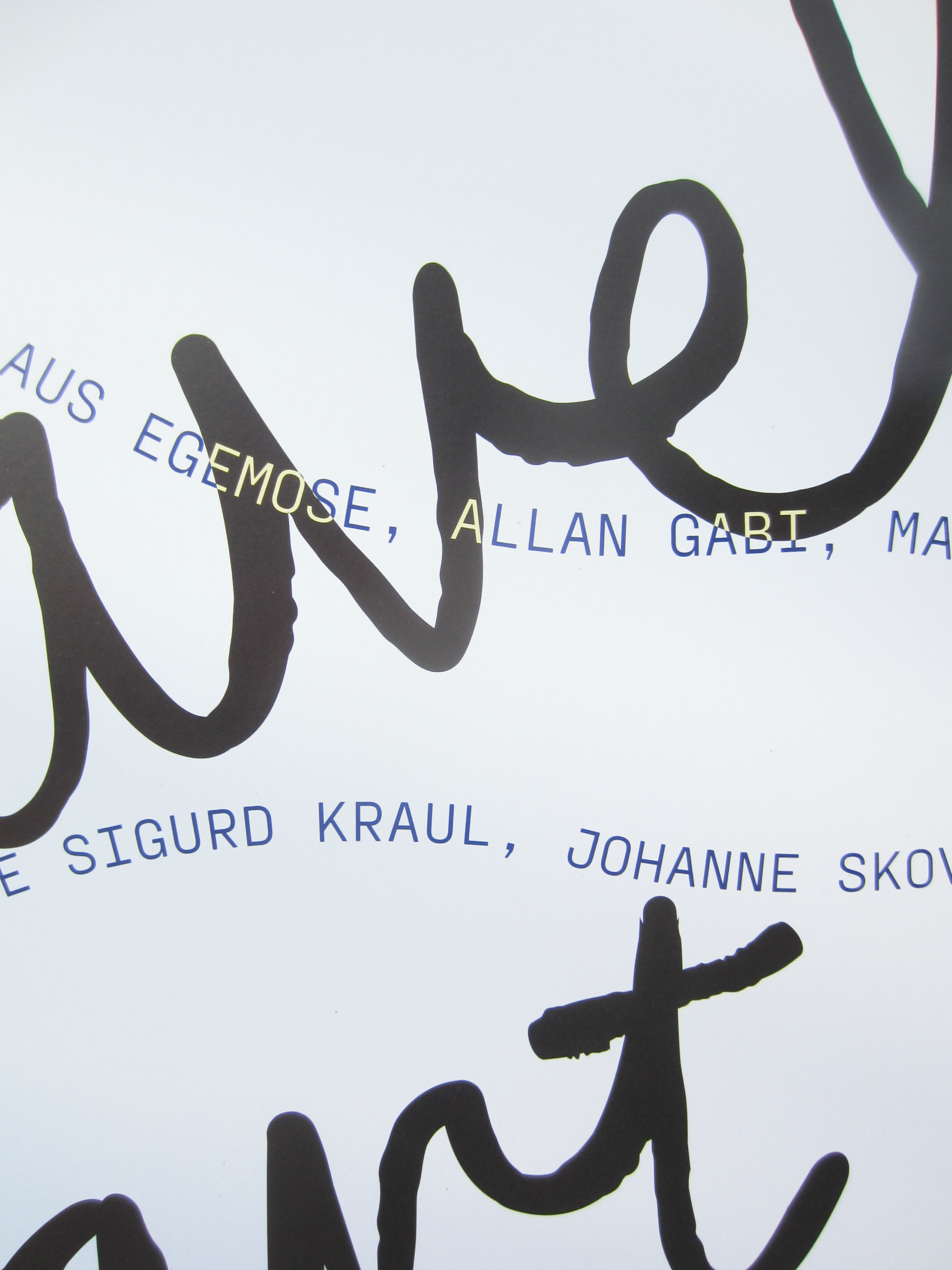
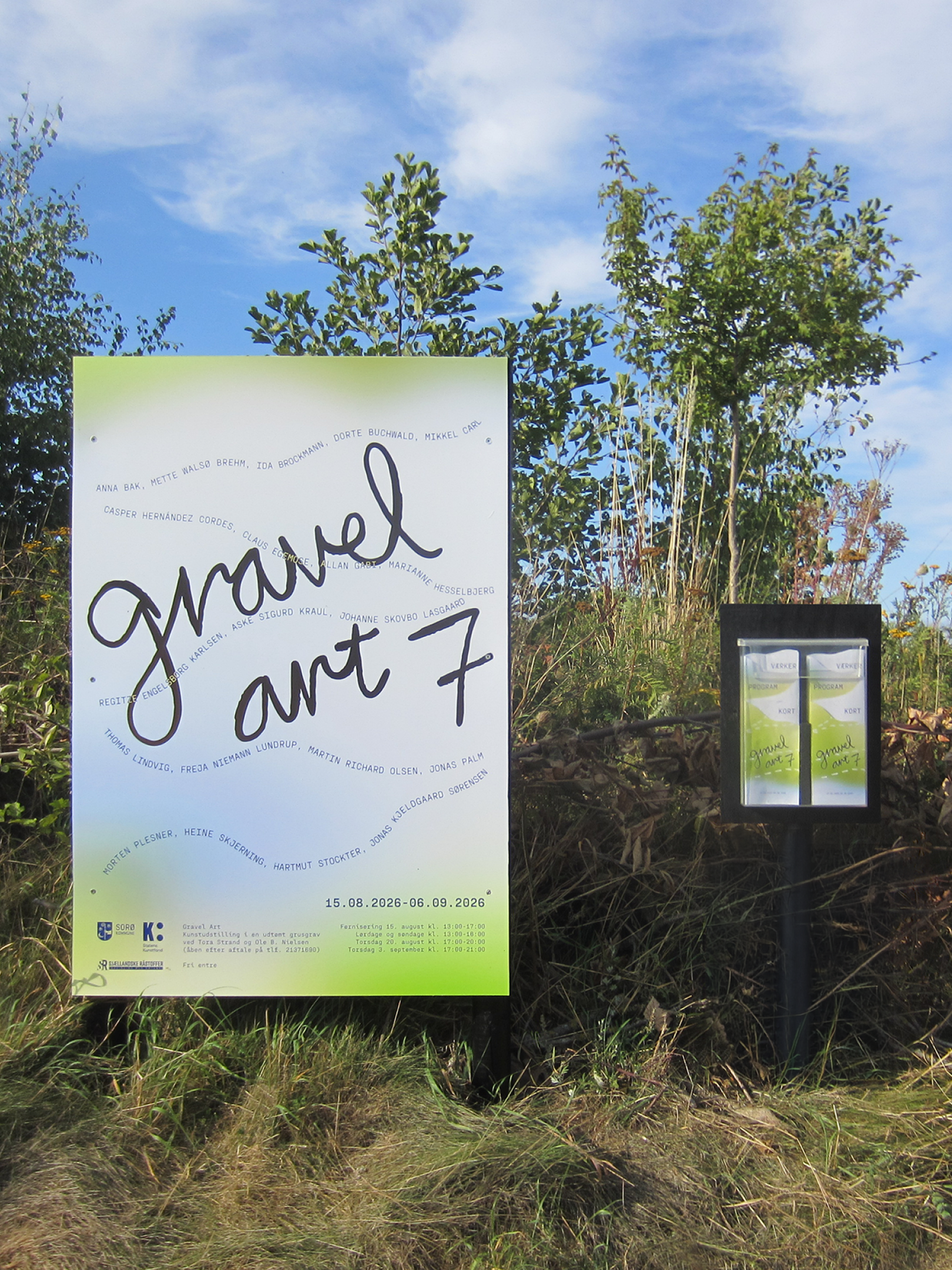
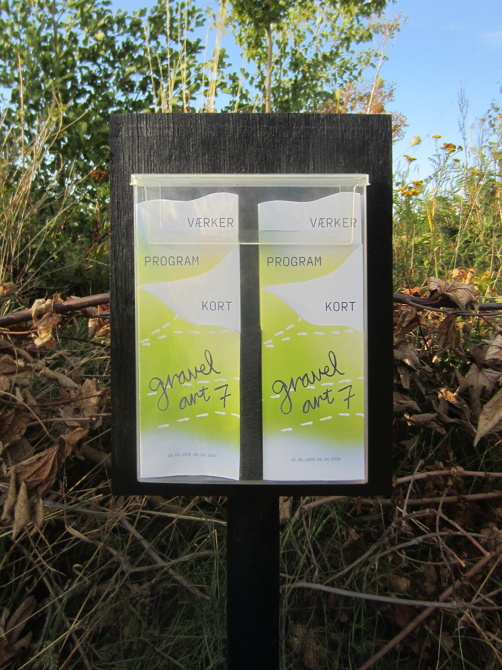
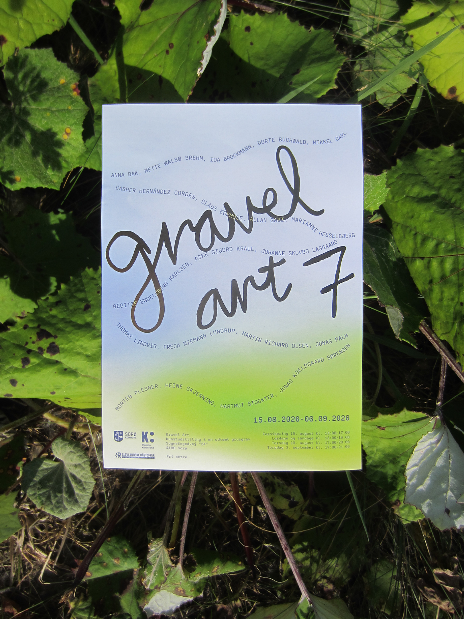
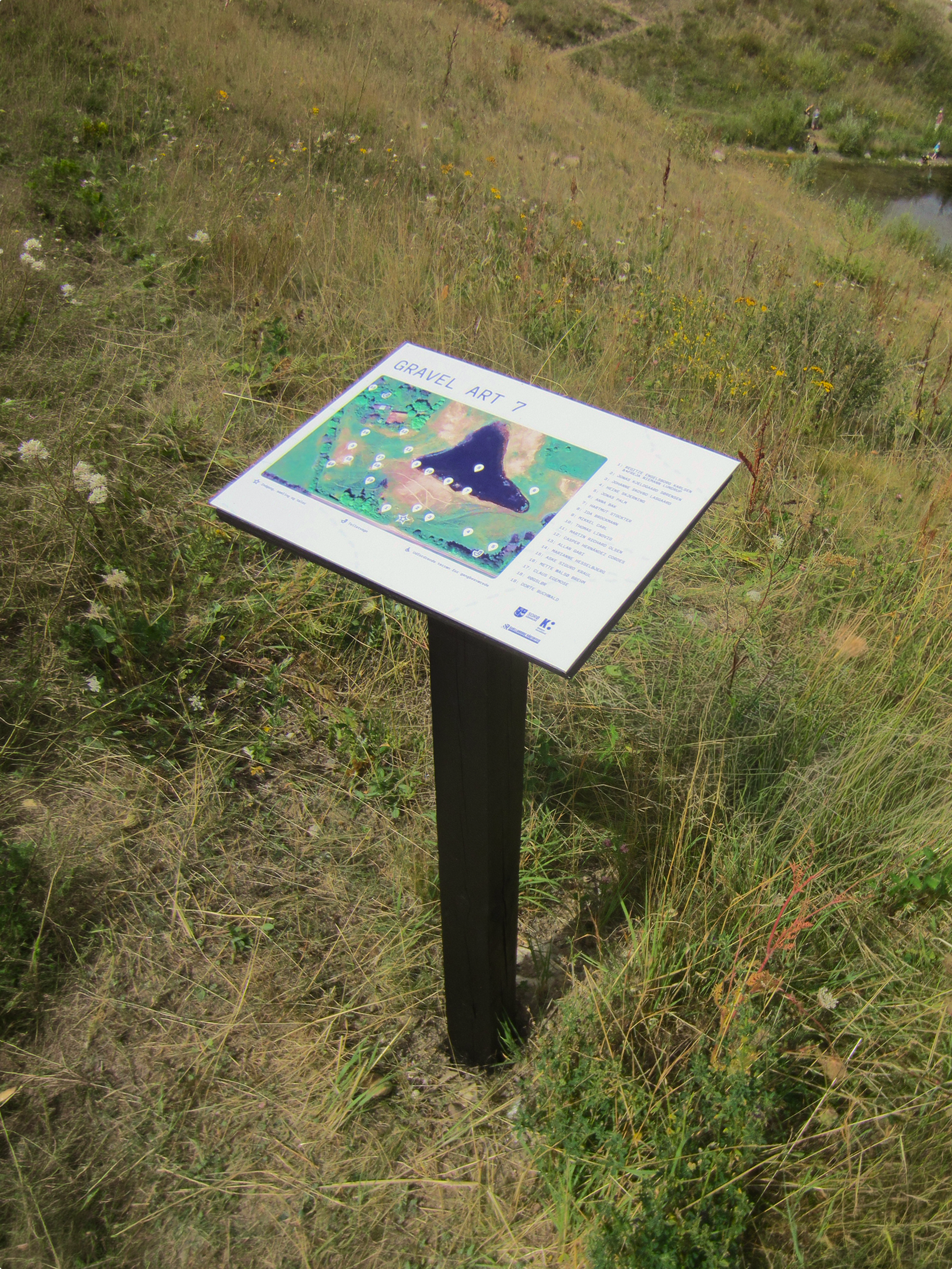
The visual identity adapts across formats, scales and purposes. A large entrance poster captures attention on site, while a freestanding map helps visitors navigate the exhibition. Smaller flyers translate the motion poster’s visual language into print, and the information-rich folder brings together the programme, site map and artwork overview.
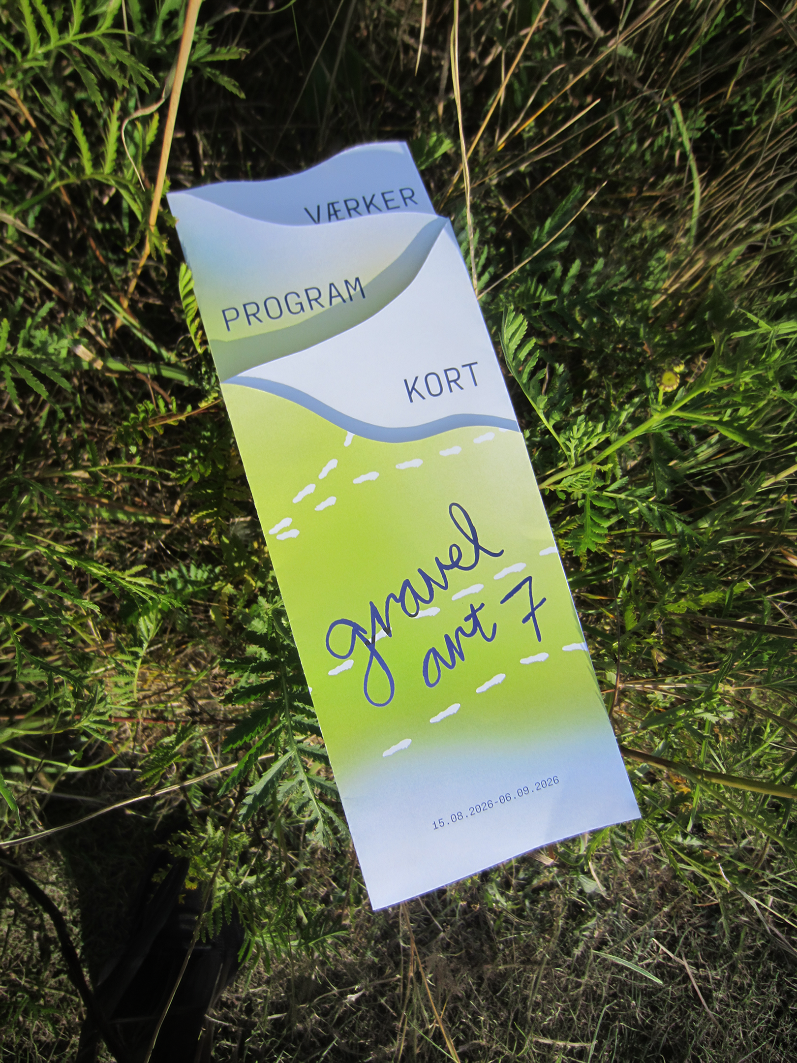
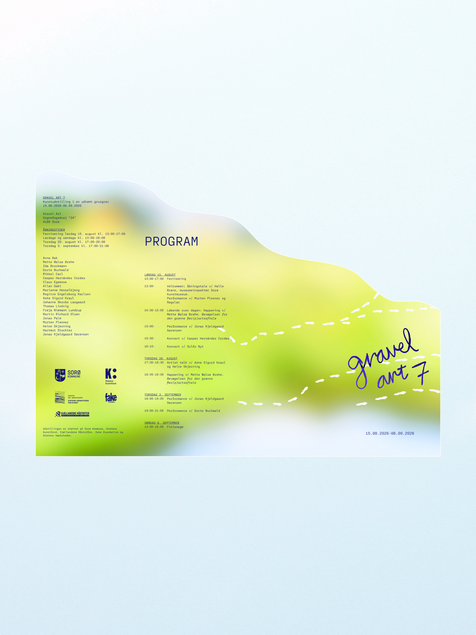
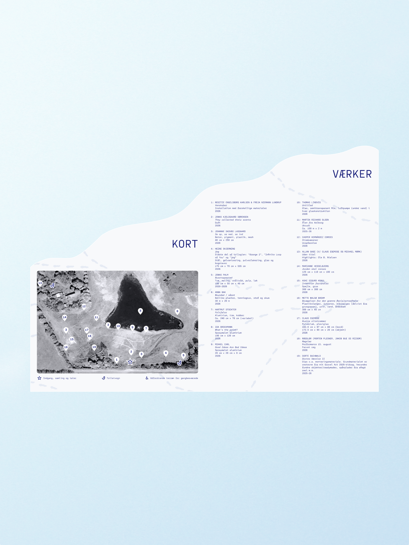
The folder’s cut top edge creates overlapping ridgelines when folded, echoing the contours of the gravel pit. A dotted line traces paths across the folder, connecting the map and artwork information while guiding visitors between the exhibition’s locations.